Responsive Web Design: Why Your Website Needs to Adapt to Every Screen
In today’s digital world, people access websites from a wide variety of devices—desktop computers, laptops, tablets, and smartphones. With such diversity, having a fixed, one-size-fits-all website simply doesn’t work. That’s where responsive web design comes in.
Responsive web design ensures your website adapts seamlessly to any screen size, providing a smooth and consistent user experience. Let’s dive deeper into what it is, why it matters, and best practices for implementation.
What is Responsive Web Design?
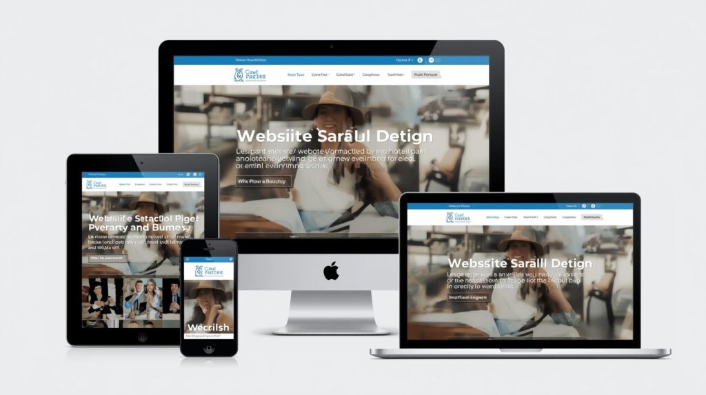
Responsive web design (RWD) is an approach to web design that makes web pages render well on a variety of devices and window or screen sizes.
Key features include:
Flexible grids and layouts that adjust automatically.
Images and media that scale to fit the screen.
CSS media queries to apply different styling rules depending on device characteristics.
Essentially, a responsive website looks good and functions properly whether viewed on a large desktop monitor or a small smartphone screen.
Why Responsive Web Design Matters
1. Better User Experience
Users expect websites to work perfectly on any device. If a site is hard to navigate on mobile, visitors are likely to leave, increasing your bounce rate.
2. SEO Benefits
Google favors mobile-friendly websites in search results. A responsive design can improve your search rankings and drive more organic traffic.
3. Cost Efficiency
Instead of maintaining separate websites for desktop and mobile, a single responsive design saves time and development costs.
4. Increased Conversions
A consistent experience across devices helps users engage more and increases the likelihood of completing actions such as signing up, purchasing, or contacting you.
Key Principles of Responsive Web Design
Fluid Grid Layouts
Design your website layout with relative units like percentages rather than fixed pixels so it adapts to different screen widths.
Flexible Images & Media
Ensure images, videos, and other media scale proportionally.
Use CSS properties like
max-width: 100%to prevent content from overflowing.
CSS Media Queries
Apply different styles depending on the device or screen size.
Example: Adjust font size or hide non-essential elements on smaller screens.
Mobile-First Design
Start designing for mobile screens first, then scale up for tablets and desktops.
This ensures the most important content and features work on smaller devices.
Touch-Friendly Navigation
Buttons, links, and menus should be easy to tap on touchscreen devices.
Examples of Responsive Web Design
E-commerce Sites: Product grids automatically adjust to fit screen sizes, making browsing smooth on both mobile and desktop.
Blogs: Text wraps properly, images resize, and navigation menus adapt for smaller screens.
Corporate Websites: Contact forms, videos, and infographics remain accessible and readable on all devices.
Tools to Test Responsive Design
Google Mobile-Friendly Test – Check if your site is optimized for mobile.
Browser Developer Tools – Most browsers allow you to simulate different screen sizes.
Responsinator – Preview how your website looks on various devices.
Responsive web design isn’t just a trend—it’s a necessity in a mobile-first world. It improves user experience, boosts SEO, saves costs, and ensures your website is accessible to everyone, everywhere.